During and after the viewing of our student music video 'Just a little' I thought It was essential to record get the audiences feedback on how they thought our music video went; In this evaluation I will be talking about the pro's and cons and what I have learned.
Audience reaction: In this reaction Eleni states that she enjoys our genre of song and how it creates ‘soft R&B, Hip Hop’ feel, she talks about the use of camera work and our use’s of editing as we showed some fast shots and slow shots showing a variety of everything that worked well together. Overall most were positive comments however one improvement she suggested was to add more movement such as dance.
Our music video showing in cinema
Audience Feedback
We can also improve on our locations as adam mentioned to have more different locations more conventional to the genre.
Another improvement suggested by our audience, was to add more effects and to use more shots from the studio as Jerome stated the studio shots were the strongest shots throughout the music video.
During the showing of our music video I could see that everyone was enjoying it, also as we choose a song from Tinie Tempah's album not much people had heard our chosen song before which made it more fresh and unique to listen too.
When Our music video had finished there was applause from the audience which hopefully showed our music video was a success. After the screening of all student music videos I interviewed my friends, who had been watching our music video, Most things they said were positive and there weren't much negatives however I thought if I had a chance to change certain aspects of our music video it would be one to change one of our locations for example; In the studio as the black curtains didn't cover all areas of the window light from outside was coming out of corners, resulting in our music video not looking as professional on camera. Luckily our audience didn't seem to notice it or if they did they didn't pay much attention to it.
Overall from creating my music video I have learned more about how to use different technical software’s such as; Final cut pro, live type ect. Also using the advanced cameras in creating certain shots and angels we wanted and advancing on our planning and organisation skills so we were able to meet deadlines. However from all the audiences’ feedback I have also learned about the stuff I could improve on to make my music video look the best it can. As one of my audiences feedback suggested to add a female, to some of the shots in the music video as this would be a useful convention in linking the lyrics with the video as the lyrics was mostly about a girl nevertheless our main plan from the start was to use a female In some of the shots however we did not have enough time to find and choose a girl to be in it, If I had a chance to change this I would think more about improving our organisation and planning skills so we had enough time to achieve what we wanted from the beginning although as we was working on a low student budget some aspects we wanted to use such as; a fancy car or having one of our locations in a penthouse, was not possible to use as we couldn’t afford this with the budget we had.
Overall from creating my music video I have learned more about how to use different technical software’s such as; Final cut pro, live type ect. Also using the advanced cameras in creating certain shots and angels we wanted and advancing on our planning and organisation skills so we were able to meet deadlines. However from all the audiences’ feedback I have also learned about the stuff I could improve on to make my music video look the best it can. As one of my audiences feedback suggested to add a female, to some of the shots in the music video as this would be a useful convention in linking the lyrics with the video as the lyrics was mostly about a girl nevertheless our main plan from the start was to use a female In some of the shots however we did not have enough time to find and choose a girl to be in it, If I had a chance to change this I would think more about improving our organisation and planning skills so we had enough time to achieve what we wanted from the beginning although as we was working on a low student budget some aspects we wanted to use such as; a fancy car or having one of our locations in a penthouse, was not possible to use as we couldn’t afford this with the budget we had.
Another one of our audience feedback commented on how she especially liked our studio shots as she thought it was the most effective out of the other locations. However she thought that some shots were quite dark therefore you wasn’t able to see the artists as clearly as we wanted, to overcome this it would be appropriate to either change the studio to a more brighter location or to use a head top light to see the artists more clearly. What I’ve learned from this is what audiences find important from music videos and how to use the camera more effectively as she also suggested that some shots were quite shaky resulting in shots looking less professional, if we had a chance to improve we could maybe hold the camera more steady.
Audience feedback on my ancillary products
Pros
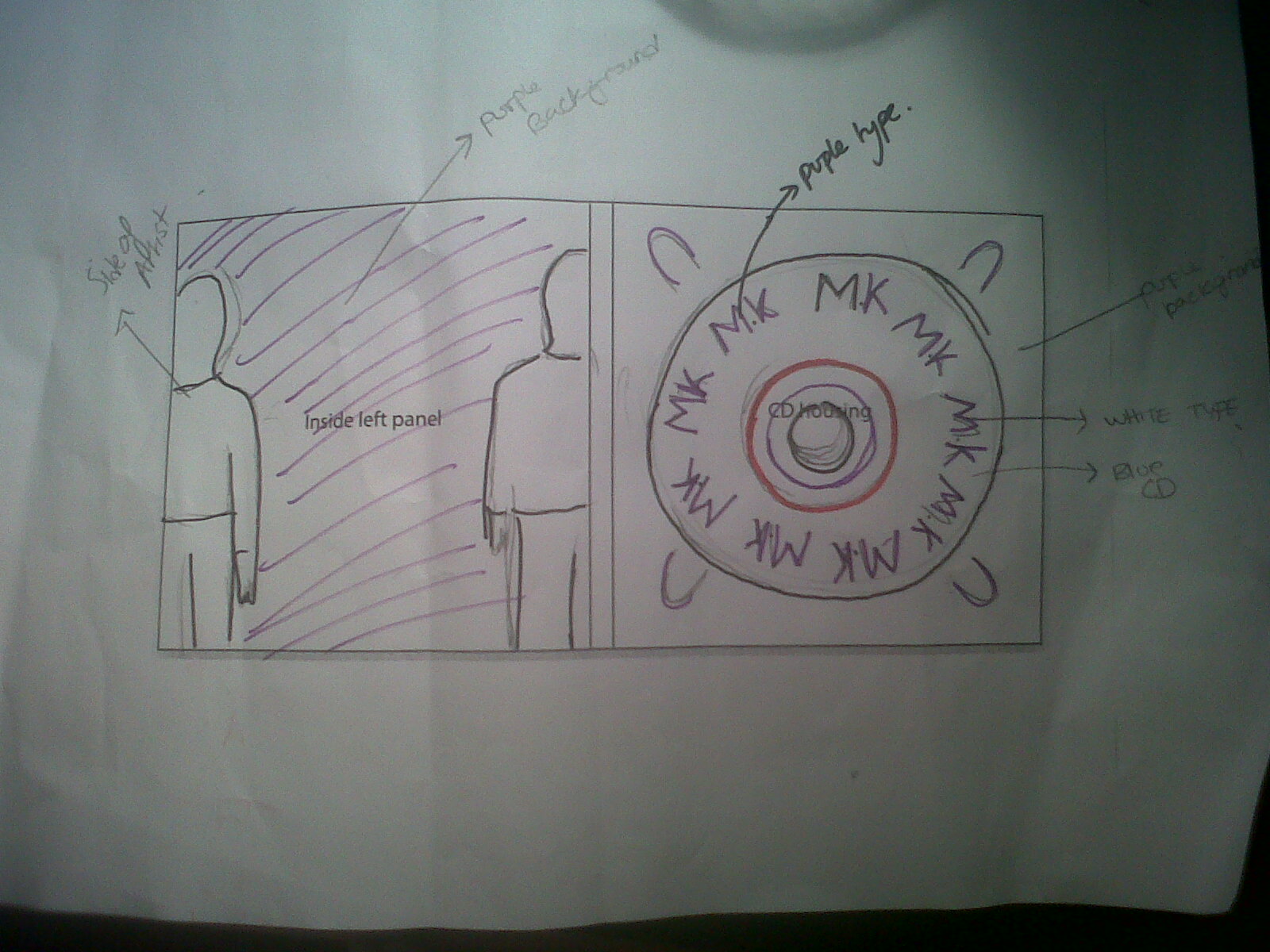
- The Inside panel of Digipak- Effective use of colours as my chosen CD panel colour is a muted purple to the background, which works well together.
- Use of image- Establishing our main artist and promoting his image to the audience.
- Chosen Shapes and fonts make It look up to date with other urban/Rap covers
- Grafti writing used for main artists name 'M.K' is effective as it gives a sense of the genre and his image.
Cons
- To crop image more exact on Photoshop and to get out the rough edges around the image so that it looked more professionally done on my ancillary products.
- However As I am not used to using Photoshop I mainly only knew the basics so It was difficult to create certain aspects I wanted on my Digipak such as creating an airbrush effect.
Pros
- Interior of CD fits together really nicely
- Good sense of energy from our performer on the advertisement.
- Effective choice of images as there are two different postures from one artist.
- Uses of font (graffiti) create visual links between the genre and artist.
-There wasn't much cons in this feedback however she did point out that the font used on the title of our artist 'M.K' for the advertisement was different to the font used on my front CD panel for 'M.K's name.
Throughout the progression of creating my Digipak and advertisement I learned more how to use the technical design software’s such as; Photoshop or Quark express and the benefits of ancillary products to my audience, as some of the feedback suggested what aspects best appealed to them when looking at my Digipak and advertisements and what they liked the most of them. For example; both feedback’s stated that they thought the use of font (Graffiti writing) was most effective as it gave a sense of the artist and the genre he was promoting which also creating visual links between all of my products.