Showing posts with label denise mantey. Show all posts

Friday, 27 January 2012

EVALUATION: QUESTION 4.

AFTER CREATING A MUSIC VIDEO FOR 'JUST A LITTLE'. OUR GROUP VIDEOED A FEW RESPONSES FROM FELLOW MEDIA STUDENTS WHO HAD CREATED THEIR OWN. AFTER THE SHOWING OF THE CINEMA.

Audience Feedback 


MAIN COMMENTS OF IMPROVEMENTS: 
- Studio shots
- Adding a variety of editing: edits were simple
- More/Different locations
Overall comments were positive however we did have a comment about one of the outfits not being attractive. this was important feedback because the artist was a female which we feel that is our main target audience. Therefore I would change the outfit so it is more attractive if we had more comments on that.  Also in the studio some shots didn't have a good focus and the black curtains allowed some light to come in luckily our audience didn't seem to notice it or if they did they didn't pay much attention to it.  However if I had a chance to re-do the video. I would re-shoot more of the studio shots as a lot of people favoured this location and wanted more. For the comment of improvement concerning the locations of adding or changing locations to fit the conventions of our genre. If I had a higher budget I would have chose a location in a night club where there would be a a lot of lights etc. and much more materialistic things. You have to give what the audience wants!


                                       ANCILLARY PRODUCTS!
inside panel
front panel


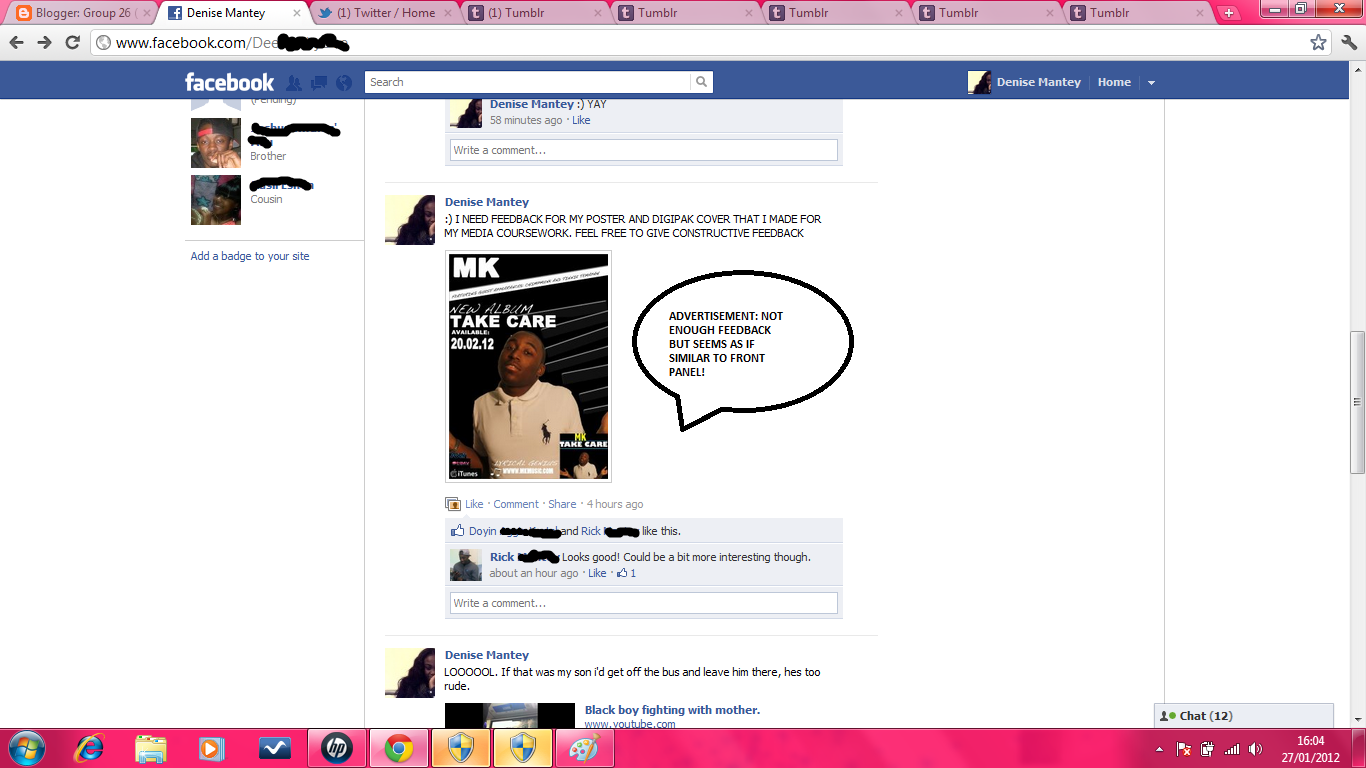
MAIN FEEDBACK: ANCILLARY PRODUCTS LOOKED LIKE REAL MEDIA PRODUCTS BUT THE FRONT PANEL (GOOD COLOUR SCHEME) AND ADVERTISEMENT ARE TOO SIMPLE. WHAT I COULD DO WITH FEEDBACK?: IF I WAS TO CREATE THEM AGAIN I WOULD EITHER TAKE A PHOTOSHOP CLASS SO I CAN USE IT TO ITS FULL POTENTIAL. FOR EXAMPLE INSTEAD OF HAVING A PLAIN BACKGROUND HAVE IMAGES FROM THE LOCATION, LEICESTER SQUARE WHICH WOULD FIT THE GENRE.

Friday, 20 January 2012

EVALUATION: QUESTION 2. VOICE RECORDING


EVALUATION: QUESTION 1.


OUR VIDEO IS A DISJUNCTURE AS IT IS MOSTLY PERFORMANCE ( ANDRE GOODWIN'S THEORY). IT FOLLOWS THE CHORUS - VERSE -CHORUS STRUCTURE. THE CHORUS ARE SHOT IN THE STUDIO MAKING IT THE MASTER TRACK. THE RETURN OF LOCATIONS HELPS THE AUDIENCE TO KNOW THE ARTIST AND HIS BRAND ,WHICH ARE THE GLASSES.
THERE ARE 2 DIFFERENT LOCATIONS: ALEXANDRE PALACE AND LECIESTOR SQUARE. THERES A CLEAR VISUAL DIFFERENCE DURING THE BRIDGE AS IT SWITCHES BETWEEN THE LOCATIONS.

Friday, 13 January 2012

Shortlist: Pictures


Pcitures that were chosen but never got put in the end product!
Changed colours of the colour of title. I didn't feel yellow suited my work before.


Added an artist website and the record company i forgot! (SBTV)


Kept the same.

Wednesday, 11 January 2012


WILL THIS BE MY FINAL PRODUCT OR WILL I IMPROVE AND MAKE CHANGES ?
IN THE PROCESS OF WORKING ON THE ADVERTISEMENT.

Friday, 16 December 2011

MOCK UP FOR DIGIPAK

FRONT PANEL AND BACK PANEL
CD HOUSING AND INSIDE PANEL

MAGAZINE ADVERTISEMENT

Examples of Students digipak - No Urban

Magazine advertisement

Front of digipak

Back cover for digipak

Magazine Advertisement
4 panels of digipak


Magazine Advertisement
4 Panel of 


Digipak text

TEXT CHOICES FOR DIGIPAK - URBAN FEEL..

Magazine advertisement - Inspirations.


TINCHY STRDER MAGAZINE ADVERTISEMENT.
- A big centre picture of the main artists.
- Catchy slogan 'Star in the hood' associated with artist.
- Simple outfit (white top = my artist)
- Artists name in big, white writing.

                                        
     TINIE TEMPAH MAGAZINE ADVERTISEMENT. 
- Picture being shot outside
- Artist wearing dark glasses
                            - Urban feel to the magazine, relating to genre.
WRETCH 32 ADVERTISEMENT MAGAZINE
- A picture with artists mot facing audience ( I would like to do this)
- Hands in Pocket - a 'COOL' look.
- Words going across the body of artists (I like!)

Do's and Dont's.

Do's.


  • Clear font so the audience know exactly what they're buying.
  • The design of digipak relates to the genre and the house style
  • Include: Barcodes, copyright symbols, catalogue number etc
DONT'S.
  • Do not use text that is difficult to use.
  • A design that is too complex.
  • Place text over the artists face.

First attempt using Quark express, Font Case and Photoshop to make my DIGIPAK

Wednesday, 7 December 2011

Evaluation to audience feedback

During and after the viewing of our student music video 'Just a little' I thought It was essential to record get the audiences feedback on how they thought our music video went; In this evaluation I will be talking about the pro's and cons and what I have learned.

Our music video showing in cinema 

Audience feedback

Audience feedback

During the showing of our music video I could see that everyone was enjoying it, also as we choose a song of Tinie Tempah's album not much people had heard our chosen song before which made it more fresh and unique to listen too. When Our music video had finished there was applause from the audience which hopefully showed our music video was a success. After the screening of all student music videos I interviewed my friends, who had been watching our music video, Most things they said were positive and there weren't much negatives however I thought if I had a chance to change certain aspects of our music video it would be one of our locations for example; In the studio as the black curtains didn't cover all areas of the window, we managed to get light coming out of corners , which didn't look professionally on camera. Luckily our audience didn't seem to notice it or if they did they didn't pay much attention to it.