Wednesday, 14 December 2011

Do's and Dont's of design work

DO

  • Clear font
  • appropriate sizes for images and fonts 
  • Clear photos that are in focus 
  • Photos that are an appropriate shape for the page
  • Layout that follows the rule of thirds for composition 
  • Appropriate type face that relate to genre conventions and the house style 
  • Place font clearly so you can see from a distance and follow the genre conventions 
  • 3 colour rule: images, font and background 
  • appropriate logos and conventions. 
DON'T
  • Stretch images = Images look out of focus 
  • use layer styles 
  • unnecessary effects that don't suit the genre
  • font that has been placed across the artists face
  • Using a photo on every panel. 

Magazine advertisements

These are three magazine advertisements that I thought related to our genre and audience.


RWD - Magazine advertisement. 
- Has similar aspects to our music video 


  • The picture has been taken off them outside, which is similar to our music video, as we also have parts of our music video outside in Alexandra Palace.
  • All three artists Tinie Tempah, Mo Farah and Devlin are all UK grime artists which is the same as our two artists M.K & Range. 
  • The style of the font and layout of the magazine advertisement looks quite urban and relates well to the genre of the three artists. 
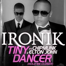
  • Tinie Tempah also has relation to our music video as our chosen song was sang by him. In the magazine advertisement Tinie is wearing Ray-ban glasses which is similar to our music video as in most shots taken our artists mainly wearing ray-bans. 

Wretchrospective - Album cover/ Magazine advertisement.


  • Genre: UK Grime/Hip hop 
  • The colours are quite similar to our colour scheme in our music video (Blue,White,Black and red) 
  • Wretch's choice of clothing (Plain white top and jeans), in part of our music video (studio) our artists also wear white shirts and jeans. 
  • Font and layout represents urban culture. 
  • Icons in the corner are quite popular within our target audience.
RDW- Tinchy Stryder magazine 


  • Similar colour scheme (white, Black, red) 
  • Outfit (jeans and white top) 
  • Catchy logo- Represents artists 
  • Font and layout expresses artists image also urban music
  • Genre: Grime/Hip hop
Labrinth- magazine advertisement for album  


Monday, 12 December 2011

Presentation

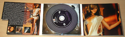
This is a digipak presentation I found on the internet and I thought it would be useful to use as it explains what the contents and style of a digipak is meant look like and why it is important. Digipak Research

Sunday, 11 December 2011

Thursday, 8 December 2011

What is a digipak ?


Digipacks/Magazine DO AND DONTS!

DO

  • USE CLEAR FONTS
  • USE A LAYOUT THAT FOLLOWS THE RULE OF THIRDS FOR COMPOSITION
  • USE AN APPROPRIATE GENRE CONVENTION AND HOUSE STYLE
  • USE PHOTOS THAT ARE AN APPROPRIATE SHAPE OF THE PAGE
  • USE APPROPRIATE INDUSTRY LOGOS, BARCODES,COPYRIGHT E.T.C


 DONT
  • DONT STRETCH IMAGES, THIS WILL MAKE THEM OUT OF FOCUS
  • USE LAYER STYLES
  • USE UNNECESSARY EFFECTS
  • PLACE TEXT ACROSS THE ARTISTS FACE
  • USE A FONT SIMPLY BECAUSE YOU LIKE IT

Wednesday, 7 December 2011

Researching digipacks!


These are a few cool digipacks i found, Beyonce,
Britney spears and Katy perry who are world wide artist.

Digipak Research


I looked at different digipaks that I thought had similar aspects to my genre and audience.


The importance and function of digipaks to the music industry

Function of digipak
Digipaks are a modern approach to CD packaging made out of card stock or other heavy paper/cardboard material. Digipaks can flip open like a book, or it can have three parts, so that one portion of the packaging opens to the right and one to the left, with the CD in the centre part. Usually, the part of the digipak that holds the CD is made of plastic like a traditional jewel case CD - the plastic part is simply attached to the paper background.
  • It allows sophisticated graphics than can run across all of the panels establishing a graphic theme. 
  • Includes a lot more information on the band/artist in the form of a small stapled booklet that is inserted into a small packet in the digipak- Makes more exciting for buyers of product. 
  • Could allow more than one disc i.e. DVD extras or additional recordings that accompanies the release of the song, album or DVD.
  • They look nice, and many bands and labels like to use them for aesthetic reasons. The three section digipack sleeves opens up more design options because there is more room. However, they're more expensive than traditional liner notes and jewel cases.
Importance of a digipac
The main Importance of Digipacks is to promote the artist to a wider audience in that it reinforces the artist’s image. To the music industry, it reinforces the artist therefore there is more chance of selling the product. Lastly, the visual aspects help link between the 3 products which promotes the branding image of the artist.

Evaluation to audience feedback

During and after the viewing of our student music video 'Just a little' I thought It was essential to record get the audiences feedback on how they thought our music video went; In this evaluation I will be talking about the pro's and cons and what I have learned.

Our music video showing in cinema 

Audience feedback

Audience feedback

During the showing of our music video I could see that everyone was enjoying it, also as we choose a song of Tinie Tempah's album not much people had heard our chosen song before which made it more fresh and unique to listen too. When Our music video had finished there was applause from the audience which hopefully showed our music video was a success. After the screening of all student music videos I interviewed my friends, who had been watching our music video, Most things they said were positive and there weren't much negatives however I thought if I had a chance to change certain aspects of our music video it would be one of our locations for example; In the studio as the black curtains didn't cover all areas of the window, we managed to get light coming out of corners , which didn't look professionally on camera. Luckily our audience didn't seem to notice it or if they did they didn't pay much attention to it.